5 lessons we learned adding dark mode to WorkOS
Designing a dark mode version of your app comes with its own challenges. In this post, we will share some of the lessons we learned during the implementation of dark mode at WorkOS.
More than a trend, dark mode is emerging as a common user preference. While we’ve been busy working a lot of other important improvements (there are seven updates to our changelog in July!), we decided to make dark mode available for WorkOS.
Designing a dark mode version of your app comes with its own challenges. In this post, we will share some of the lessons we learned during the implementation of dark mode at WorkOS. If you want to see the end result, you can try WorkOS in dark mode here.
1. Measure the contrast ratio
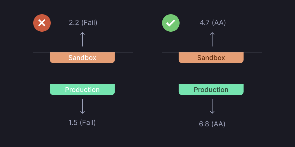
The biggest challenge of any dark theme is meeting the accessibility requirements to ensure users with all ranges of vision can access information.
Thankfully, you can mathematically know if two colors have enough contrast by adhering to the Web Content Accessibility Guidelines (WCAG). To get a passing grade (AA), the contrast ratio needs to be at least 4.5:1.
Let's take the WorkOS environment badge as an example. Achieving a good contrast ratio is very difficult when using white text on a colored background. Using dark-colored text on a soft-colored background is much easier to read.
By applying these changes, we learned another lesson: adding a dark theme can improve the light theme.
2. Stay away from pure black
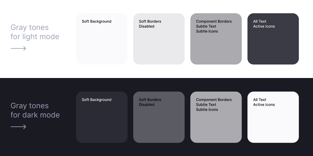
One of the first things we did as we embarked on this dark mode journey was to invert all colors. Everything that was pure white (aka #FFF) became pure black (aka #000).
The problem is that white has 100% color brightness, and black has 0% color brightness, creating the highest contrast possible. Such a disparity generates intense light levels that overstimulate the eyes.
Have you noticed how book publishers don't use pure white paper because the contrast with black ink is too severe? Books printed on cream paper don't cause eye strain. That's why publishers have been using this technique for hundreds of years.
The same goes for digital devices. Good dark mode applications use shades of grey instead of pure black. Our solution was to come up with different tones of grey for both light and dark mode.
3. Re-evaluate your color palette
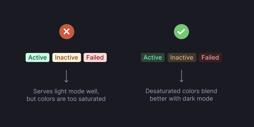
You’ll often need to tweak colors in a dark theme to evoke the same response in a light theme.
The blue color we used for links, for example, read differently on black than on white. The same thing happened with status pills.
When adding dark mode, lighter and desaturated colors like pastels are easier on the eyes than vibrant colors. That’s because saturated colors produce optical vibrations against a dark background, which can induce eye strain.
Lighter tones ensure that your elements are still accessible and have a proper contrast ratio against the dark background.
4. Establish the visual hierarchy
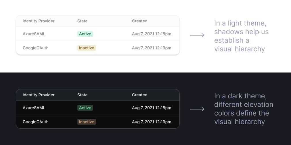
Shadows are a great way to generate visual hierarchy in light themes since they help you express elevation.
However, shadows do not work in dark themes. Even if your background is not 100% black, shadows will still not be enough to differentiate blocks of elements.
One solution can involve borders, which help lighten the container bounds without drawing the eye away from what's important — the content in the box. Still, the key to a successful visual hierarchy in dark mode is elevation colors.
Raising an element closer to an implied light source builds a sense of depth. That means that the higher a surface's elevation, the lighter that surface becomes. That's why the WorkOS sidebar is lighter than the rest of the page.
5. Let the user choose
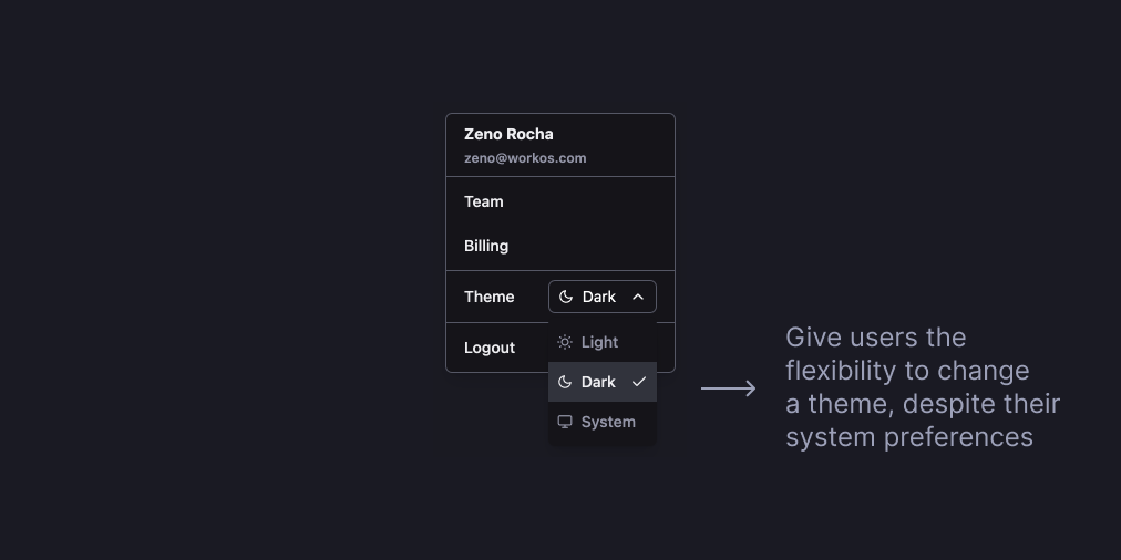
One misconception developers have with light/dark mode is automatically applying a theme based on the system user preferences.
Although it's safe to assume that users might want their apps to follow that preference, it would be best if they had the option to switch to a different theme manually.
There are all sorts of reasons a user might want to switch. Maybe they want to take a screenshot in light mode, record a screen share in dark mode, or simply prefer to use your app with one theme or another.
Regardless of the use case, you should give them the control to change.
Conclusion
Dark mode sounds straightforward enough, but getting it just right—and making it awesome—takes consideration. Thanks for reading this, and I hope you get a chance to implement dark mode into the programs you’re working on as well!
For the WorkOS users, whether you prefer your screen bright or if you want to feel like a hacker using dark mode, it’s up to you how you experience the app.
Enjoy the dark side! 🖤
If you liked this post, you can try WorkOS in dark mode here. If you also want to spend your time working on creating great developer experiences, we are hiring. If you ever want to talk about developer experience (or dark mode), please tweet or DM me!