UX best practices for MFA
A practical guide to designing user-friendly multi-factor authentication (MFA) flows that improve security without sacrificing user experience, covering both enrollment and sign-in best practices.
Multi-Factor Authentication (MFA) is one of the most effective ways to secure user accounts. But while security is critical, a clunky or confusing MFA experience can frustrate users, discourage adoption, and even lead to abandonment.
Designing a seamless, intuitive MFA experience—both during enrollment and at sign-in—helps build trust and keeps users protected without adding unnecessary friction.
This post outlines key UX strategies to create a better MFA journey for your users.
1. Design a flexible enrollment experience
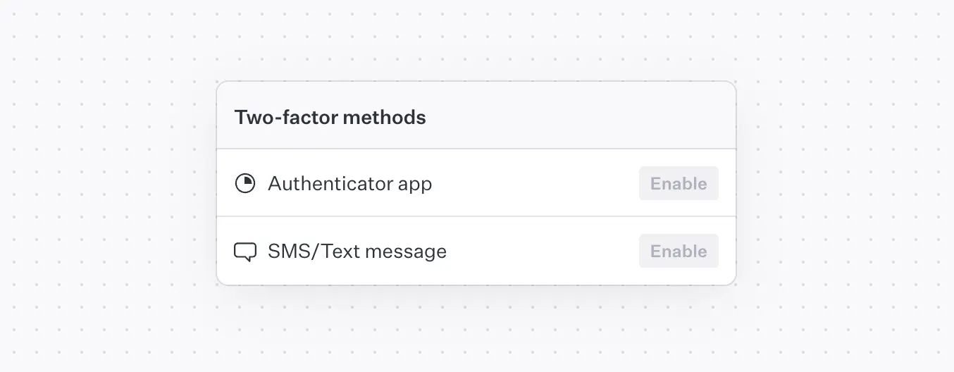
Offer multiple authentication methods
Not every user will have access to the same devices or feel comfortable with a specific MFA method. Supporting multiple enrollment options (e.g., SMS, email, authenticator apps) provides flexibility and helps increase adoption. For example, a user without a smartphone can still enroll via email or security keys.
Show all available options during enrollment.
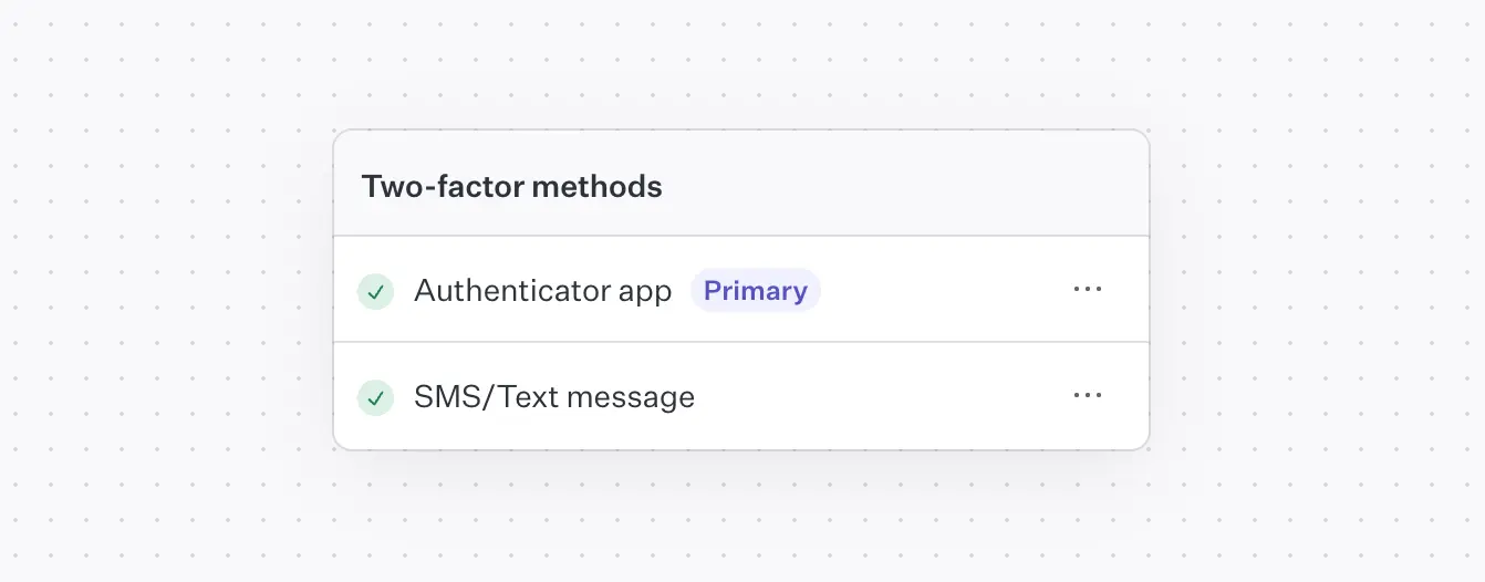
Let users choose a primary method
If a user enrolls in multiple MFA methods (e.g., SMS and TOTP), allow them to choose a preferred default. This not only improves usability but also increases the likelihood that users complete the verification step smoothly.
Make it easy to set or change the primary method from account settings.
Ensure accessible TOTP setup
TOTP (Time-based One-Time Password) apps like Google Authenticator or Authy often rely on QR codes. But not all users can scan a QR code, especially those using screen readers or limited vision.
Make your implementation inclusive by:
- Displaying the TOTP secret key as text, so users can enter it manually.
- Describing the QR code with accessible alt text or ARIA attributes.
- Offering clear, simple instructions for how to use the code in an authenticator app.
QR code accessibility example:
2. Simplify One-Time Passcode (OTP) entry
One-time passcodes (OTPs) are central to MFA, but poorly implemented input fields can break the experience.
Use the right input type
Avoid <input type="number">, which can lead to unexpected behaviors like removing leading zeroes or treating the value as a single number. Instead:
- Use
<input type="text" inputmode="numeric">for better browser and mobile compatibility. - Set
autocomplete="one-time-code"to enable autofill on supported platforms like Safari (iOS/macOS).
Enable smart autofill and submission
Where possible, auto-submit the form once the user has entered a valid-length OTP (e.g., 6 digits). This reduces the number of clicks and creates a more seamless flow.
Provide real-time validation
Use client-side validation with a regex like pattern="^\d{6}$" to catch errors before submission. This reduces failed requests and helps guide users toward success.
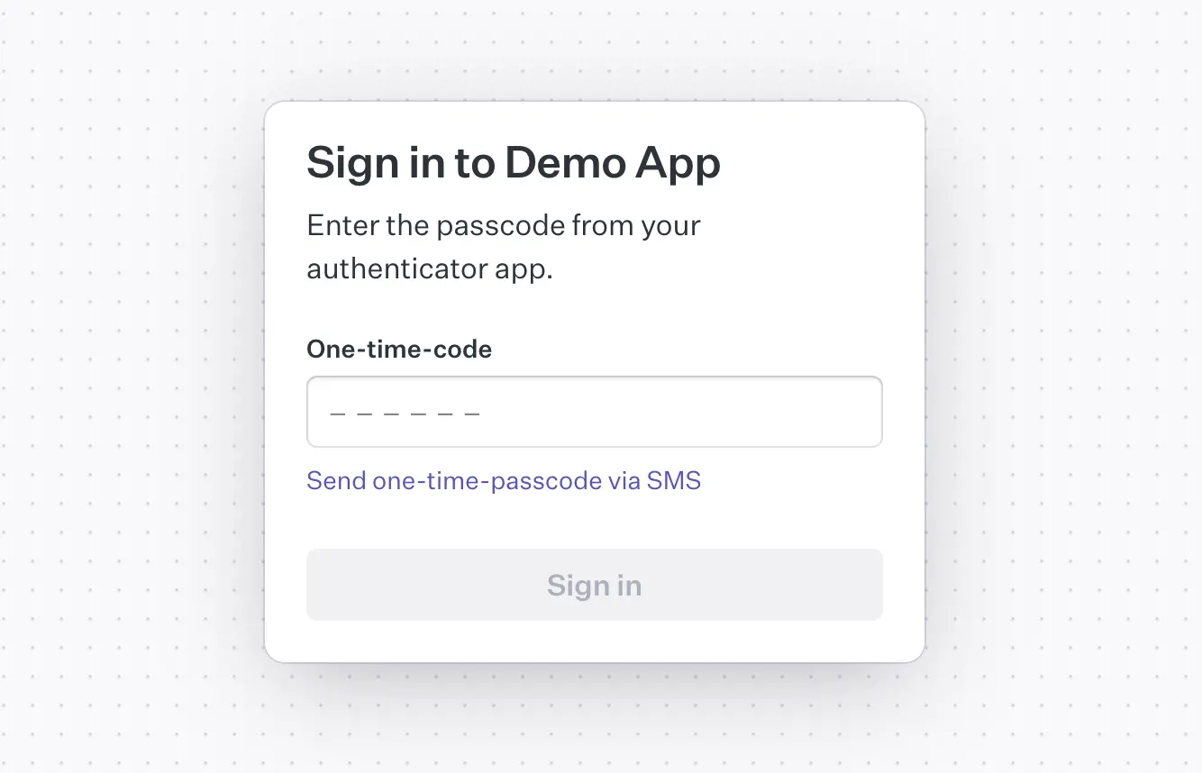
3. Streamline the MFA sign-in flow
Clearly introduce the extra step
After users enter their username and password, present a dedicated screen for MFA verification. Make it visually distinct and explain why the step is necessary to help set user expectations.
Keep the interface consistent with the rest of your sign-in UI, but emphasize security.
Handle multiple verification methods gracefully
If the user has enrolled in more than one method, show their primary method by default, but also allow them to switch. This flexibility is essential in cases where the primary method is temporarily unavailable (e.g., lost phone or poor signal).
Display a dropdown or “Try another method” link to surface backup methods without overwhelming the user.
Final thoughts
MFA is only effective if users engage with it. By prioritizing usability alongside security, you can drive better adoption and reduce churn.
When building your MFA experience, remember:
- Offer choices during enrollment.
- Make every input field intuitive.
- Minimize user effort at sign-in.
- Always design for accessibility.
Your users will thank you.