What is the difference between Radix and shadcn-ui?
Radix and shadcn-ui are both component libraries for React, but which should you choose?
Selecting the right UI component library impacts your web development project’s efficiency, maintainability, and developer experience. Two popular options you might encounter are Radix and shadcn-ui.
While both can speed up your workflow in React and other JS projects, they approach design, accessibility, and styling differently.
This article breaks down the difference between Radix and shadcn-ui—covering each library’s architectural nuances, implementation strategies, and code examples—to help you choose the best fit for your team.
What are component libraries for React?
Radix and shadcn-ui are both component libraries for React; notably, shadcn-ui is built on top of Radix, combining Radix’s flexible foundation with additional styling and components.
However, their primary focus differs:
- Radix offers low-level, unstyled components, granting developers total control over styling and architecture. This design caters to advanced use cases requiring high flexibility and customization.
- Building upon Radix’s unstyled primitives, shadcn-ui provides styled, ready-to-use components. This approach allows developers to leverage Radix’s robust foundation while expediting development with cohesive, pre-designed elements.
Radix: focused on accessibility and flexibility
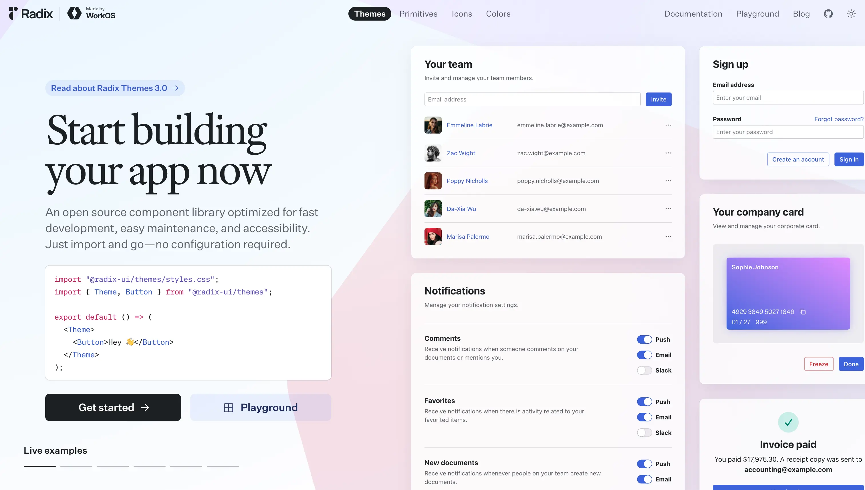
Radix is designed for developers seeking granular control over styling and architecture, making it ideal for advanced use cases where flexibility is paramount. Because Radix’s components come unstyled, you can seamlessly integrate them with your existing styles or any CSS framework.
This flexibility makes Radix popular among teams that value both custom design and robust accessibility features.
Key features of Radix
- Accessibility: Radix is built with inclusive design in mind. Each component follows WAI-ARIA (Web Accessibility Initiative – Accessible Rich Internet Applications) guidelines to ensure all users can interact effectively.
- Unstyled components: You decide how to style each component, so you are never locked into a pre-existing aesthetic.
- Composable architecture: Smaller, modular building blocks let you compose complex UIs that suit your project’s structure.
- Performance: Radix is optimized for minimal overhead, preserving snappy interactions even in large applications.
Practical implementation with Radix
Installation
npm install @radix-ui/react
Using a Radix component
import { Dialog } from '@radix-ui/react-dialog';

function MyDialog() {
  return (
    <Dialog>
      <Dialog.Trigger>Open Dialog</Dialog.Trigger>
      <Dialog.Content>
        <Dialog.Title>Dialog Title</Dialog.Title>
        <Dialog.Description>
          This is a description of the dialog.
        </Dialog.Description>
        <Dialog.Close>Close</Dialog.Close>
      </Dialog.Content>
    </Dialog>
  );
}
Common pitfalls and solutions
- Styling overhead: Because these components are unstyled, you’ll need to apply your own CSS or another styling approach. This can feel like extra work if you just need a quick UI starter.
- Learning curve: If you're new to the pattern, Radix’s composable architecture may take some getting used to. Reviewing Radix docs and examples can flatten this curve.
shadcn-ui: styled and focused on rapid adoption
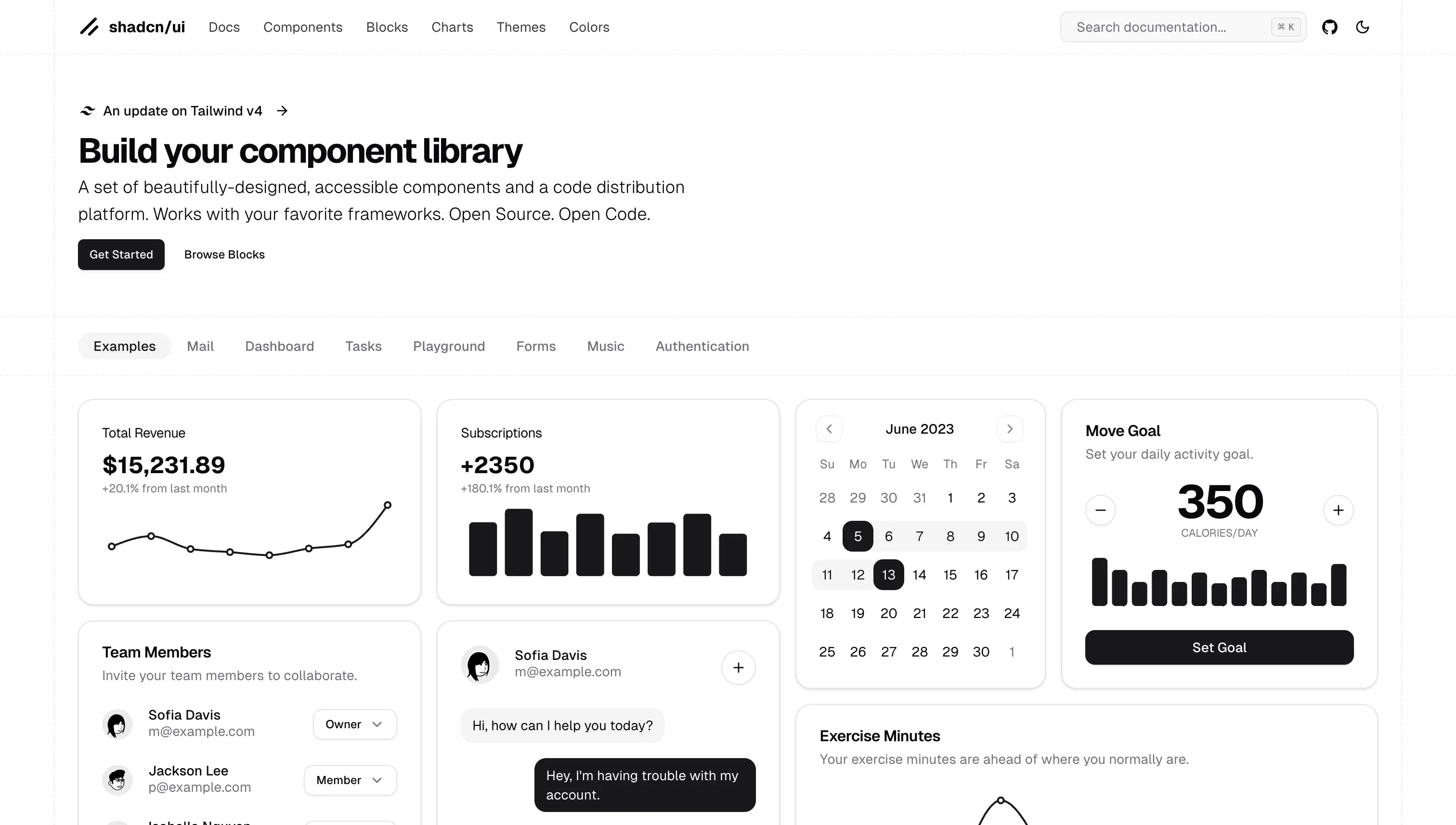
While Radix shines for those who crave flexibility and deep customization, shadcn-ui focuses on saving time by offering pre-styled components tied to a consistent design system.
If you want a cohesive theme out of the box and don’t need to craft custom styles from scratch, shadcn-ui might be a perfect choice.
Key features of shadcn-ui
- Styled components: Out-of-the-box styles let you quickly spin up visually consistent applications.
- Design system: All components follow a unified look, ensuring your app has a cohesive aesthetic.
- Ease of use: The straightforward API and ready-made styles minimize boilerplate. Shadcn is designed for rapid adoption via npx commands and integration with Next.js templates and apps optimized for deployment on Vercel.
- Customization: You can still adjust certain styles, though it may be trickier to accommodate highly specific branding.
Practical implementation with shadcn-ui
shadcn-ui builds upon Radix by offering styled, ready-to-use components, streamlining development for those who prefer a cohesive design system without sacrificing the flexibility that Radix provides.
Installation
npm install shadcn-ui
Using a shadcn-ui component
import { Button } from 'shadcn-ui';

function MyButton() {
  return <Button variant="primary">Click Me</Button>;
}
Common pitfalls and solutions
- Limited deep customization: If your design requirements are unique, you’ll likely need additional styling or a different approach.
- Design system dependency: Projects with strict branding guidelines may find the built-in styles too opinionated, requiring extra overrides.
In review
When deciding between Radix and shadcn-ui, the key lies in aligning your priorities with each UI component library’s strengths:
- Radix provides low-level, unstyled components with strong accessibility and performance. It is ideal if you want full control of styles and a composable approach to building UIs.
- shadcn-ui: Offers a complete design system out of the box, helping you move quickly if you value immediate visual consistency.
Before you commit, consider factors like desired styling flexibility, the importance of a consistent design system, and your accessibility requirements.
Both libraries effectively support modern web development, so the “best” solution is the one that fits your unique project objectives and developer preferences.